When you click the
Compare Results![]() button and select two results to compare, the
Summary window shows the difference between these results.
button and select two results to compare, the
Summary window shows the difference between these results.
Note
You can compare any results that have common performance metrics. Intel® VTune™ Amplifier will provide comparison data for these common metrics only.
Data provided in the Summary window vary depending on the viewpoint.
Difference in the Application Performance per Metrics
In the compare mode, the first Result Summary section displays the difference in the performance metrics values between the results you specified. In the example below, the VTune Amplifier displays the Basic Hotspots results difference as r004hs value - r005hs value (see the result tab title).
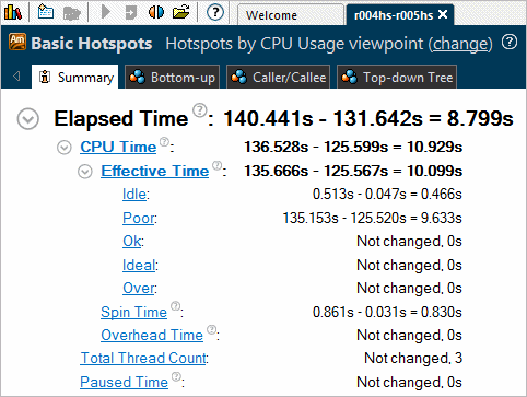
You see that the code changes in result r005hs have slightly changed the Elapsed time of the application in comparison with the baseline (result r004hs): the poor utilization of the CPU Time has reduced from 135.153 seconds to 125.520 seconds.
Clicking a metric in this section opens the Bottom-up view sorted by this metric in the Difference column.
Difference in the Performance of Hotspot Objects
In the compare mode, the Top Hotspots section displays the difference in performance values per object (object type depends on the viewpoint) between the results you specified. In the example below, the VTune Amplifier displays the CPU Time difference for the most time consuming functions as r004hs value - r005hs value (see the result tab title).
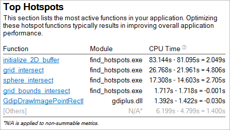
For this example, the second result r005hs introduced slight optimization in CPU Time for first three functions.
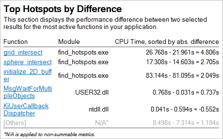
To view a list of functions that gained most from the optimization, explore the Top Hotspots by Difference section:
Performance Difference in Histograms
Depending on the viewpoint, the Summary window provides the histograms that show how certain metrics, like the Thread Concurrency, CPU Usage, or Frame rate, have changed for the specified results. Bars for both results show up side by side. In the example below, the dark-blue bars correspond to the first result, r004hs, and the light-blue bars correspond to the second result, r005hs. Hover over a bar to see the tooltip with the detailed information:
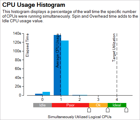
The chart shows that the Elapsed time spent within the Poor processor utilization level has slightly decreased from 136.752s (result r004hs) to 123.887s (result r005hs). This means that the changes made in r005hs have not optimized the utilization of the processor cores but introduced a slight optimization reducing the total Elapsed time.
Difference in Collection and Platform Info
The Collection and Platform section shows whether the result size and platform data has changed.
Note
You can click the
 Copy to Clipboard button next to any summary section and copy
its content to the clipboard.
Copy to Clipboard button next to any summary section and copy
its content to the clipboard.